Shirts By Mike
Client: Shirts By Mike
Role: UX Designer
Task: Website Redesign
Overview
Shirts By Mike website is an e-commerce website that sells t-shirts with frog designs featured on them. The client desired a complete website redesign, dependant on several factors. The aim of this case study is to factor in the users pain points and redesign the website by adding the following;
- They would like the site to look better
- The client would like better functionality
- A featured t-shirt of the month presented on their landing page.
Before diving into the design phases, i needed to discover the pain points for users of this website. In the following sections, i will discuss the clients goals, what pain points were addressed during preparation and then follow on to the Design phases.
Pain Points
- There are no navigation links for the user or back links once clicked on an item.
- The background color is really unappealing and dull bringing the whole website feel down with it.
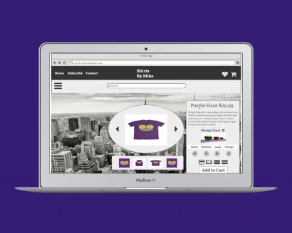
- The site does not contain a sizing guide for customers to work out their sizing. Every website has different sizing making it really difficult to know your size.
Goals
The main goals the client for Mike's T-shirts current website include;
- Increase sale by adding a featured t-shirt of the month.
- Increase sales by 20%.
- Increase unique page visits by 10%.
Audience
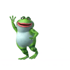
The website sells fun Froggie T-shirts designed for the 16-35 year old range.
It is vibrant and appealing which shows
they want to attract a fun loving audience.
The goal of the website is to attract a young audience to purchase T-shirts.
The client desires to attract those in the age range of 16-35 who like cool,
fun t-shirts. They want the website to be organised with minimal noise and without chaos.
Problem Analysis
I think customers would leave the website pretty early on after entering.
There is no navigation, no reviews, nor any sizing charts for customers.
It is pretty hard for customers to know what size they are going to receive and there is a lack of contact information for customers to ask questions.
Helpful features might be;
- A live chat app
- Clearly defined navigation links
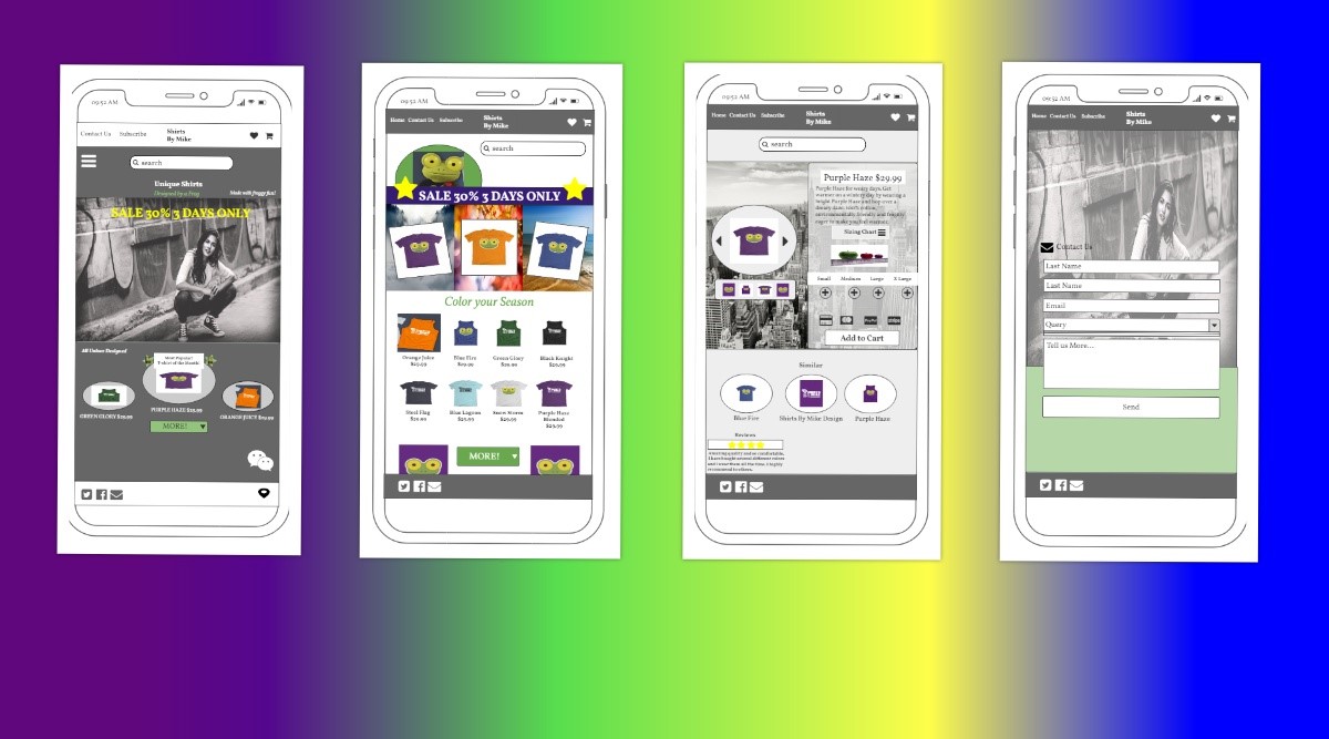
- pop out side-bar for a mobile display
- A sizing chart
- Unisex Labelling for clarity
- More vibrant background color
- Change hero to more modern picture
Competitive Analysis
DesignByHumans.com
Strengths
- The website really grabs your attention
- Fun and Vibrant appearance
- The usage of shapes well thought out
- Pagination included
Weaknesses
- Would be good to see user ratings on top of page
Threadless.com
Strengths
- Bright, fun and modern
- Information achitecture well designed
- Lots of sale items
- Pop up box for products great idea
Weaknesses
- Main picture a bit crude for a website selling children's clothing
Teepublic.com
Strengths
- Bright and fun
- Great use of shapes
- Content well organised
- Color palette display on each products good idea
Weaknesses
- No reviews on previous customer purchases
- A little expensive
Summary
First time users want the page to be familiar yet seem exciting because they haven’t seen the redesign before so clear familiar structure while bringing in new color combinations could nail this concept.
Nice bright colors would still work but i think too many colors and shapes on the page would not be fruitful.
The user would like to be able to navigate quickly and easily to find what they are after while not spending too much time trying to find what they want. I think a search functionality high up on the landing page would be sufficient in granting that need to customers.
One of the features of a good clothing store includes a clothing sizing chart. Nobody wants to have to exchange or return purchases because it doesn’t fit. Unneccessary time wasting and disappointment means goodbye customer. Make the sizing chart apparent at first glance on the product details page. I would suggest placing this directly under the title and cost of the T-shirts.
Users are going to mainly use a pc or mobile to shop at this website so using responsive styling will be an important feature.
Using a hamburger pop-out navigation on the mobile device it used by most popular websites so that would be a nice familiar
addition to include.
A wish list is always popular amongst customers enticing them to come back again to the website so i would include this in
the common top right hand side of the page alongside a cart link.
Everyone loves a sale! So utilizing this tactic that is familiar to customers while making them feel like they have
saved money rather than spent it has huge potential and also helps combat buyers remorse making it more likely for
them to return to the website.
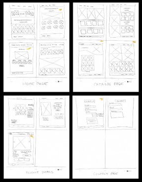
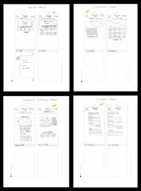
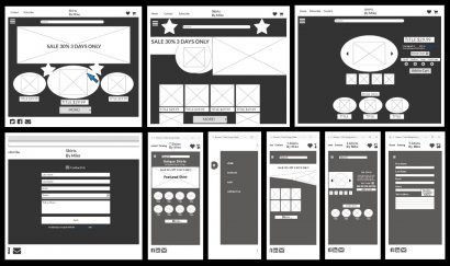
Sketches
Desktop
Mobile
Wireframes
Redesign Process
Intending to design the website as fun and warm, i decided to add more content than the original designs. I firstly jotted down some ideas of what i wanted to include for content, personality and warmth to the website while keeping in mind the target age audience, then i worked out where the content should be placed on the website making sure to use consistency and personal touch.
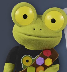
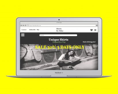
I designed the website to look more modern and uniquely branded with a real person as well as the main frog.
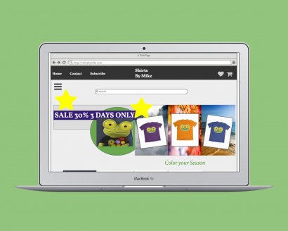
I then decided to have an approach to persuade customers in purchasing more than 1 item if that was their intention by adding a seasonal layout configuration.
This included 3 seasonal images accompanied by text directing the user to check out the image.
I have added a review system on the products page for customers to check out what other customers are saying about their purchases.
I also decided on a chatbot feature with immediate message capabilities if the customer has any questions.
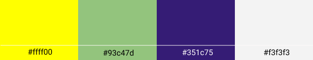
Color Palette
Typography
A stylish, yet modern type font. (From the google fonts description) = ‘Prounced; “Follkorn”, with dark and meaty serifs and a bouncing and healthy look.
It might be used in body copy, or just as well for headlines and titles.
I liked the look of the font in all areas used on the website. Vollkorn looks sophisticated yet bold as a heading, Not intrusive as body text and stands out where it needs to in the italic use case on which i used for content attention grabbers around the landing page and a little on the Catalog page.
I didn’t see the need to use any other font style besides Vollkorn.
Mockups
Landing Page
Product Page
Product Details Page
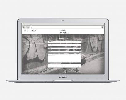
Contact Page
Mobiles
Explanation of Mockups
There were several text content items i wanted to include in this project to minimise the need for further questions either by chatbot or contact page usage.
Helpful Content
The most stand out needed items were the ‘Unisex’ banner on the landing page so the user clearly knows all sizing is gender friendly.
Inspirational Content
The reviews added to the Products page was necessary to give the user power over their purchase by feeling confident others were happy with their products which would give them reassurance of the quality and experience provided by this website.
The ‘Designed by a frog’ is inspirational as it creates a fun unique brand and highly original.
The ‘Most Popular, t-shirt of the month’ content creates a sense of community within the website, inspiring to be a part of something sacred, yet something the user can be a part of.
Descriptive Content
I added a description to the Product pages to explain more of each product to help the user find out more about the T-shirts, hence getting more of an unconscious sense of the type of people the website creators are. Fun, quirky and a little bit different.
Learnings
The main concept i learnt from this project was the fact that websites have personality. I remember browsing and forming an emotional connection with websites in the past but i never really thought of the whole personality concept. I feel as though i have been let in on a secret society and it feels empowering.
I am excited to move on to the next case study now as i think i have learnt the main value of choosing a specific personality and also how to adjust one. I learnt that not all fonts work together with a specific chosen personality. To have a seamless fit, the font must be specifically tailored to the personality type.
Most of all though, i have learnt how to utilize the hidden persuasion within a specific type of content. This is a powerful tool in getting users to return to your website creation as well as potentially making more sales.
Other Case Studies
Lowest Lane
Case Study
Grocery app 'Lowest Lane'. Company goals were to improve overall usability, determined according to user research that i conducted during usability tests..
Read MoreWhooshMail
Case Study
Created for WhooshMail, An email Marketing Campaign. Company goals involved Increasing first month retention and campaigns sent by 20% ..
Read More